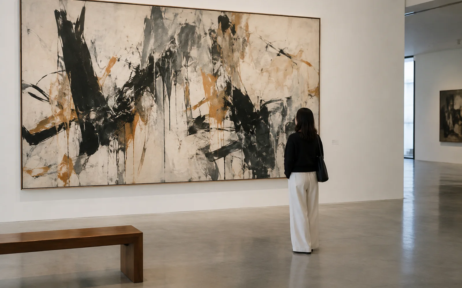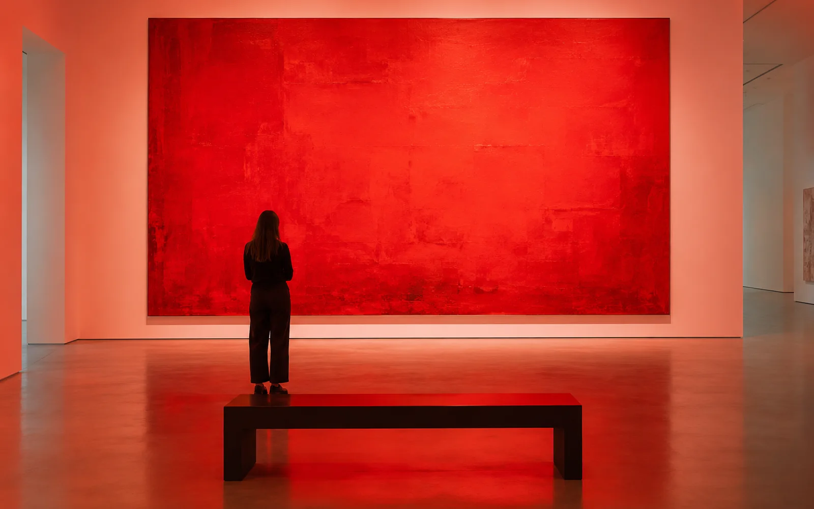
Typography begins to suggest a mood before the reader has finished the first sentence. ARKI Editorial
LETTERS AS IMAGES
Typography begins to suggest a mood before the reader has finished the first sentence.
The shape of a word
A word has a meaning we can look up and a visible form we encounter first. Its weight, spacing, and rhythm can make a statement feel urgent, quiet, playful, or formal. Designers choose these qualities with an audience and a surface in mind.
A headline on a wall must work differently from a paragraph held in the hand. The best type choices help the reader enter the idea without making the design louder than the words.

The rhythm of Georgian letters
Georgian script gives a designer a distinctive set of curves and proportions. Its beauty should not be treated as decoration that excuses poor reading. Test real words, not only isolated characters, and look at how letters meet at ordinary sizes.
A form that is elegant on a poster may become tiring in a long article. Respecting the script means caring for both its visual character and the person trying to read it.

Space between letters
The empty areas within and around type do much of the work. Tight spacing can create urgency, while more air can invite slower reading. Too much of either breaks the connection between form and language.
Print a sample, step away from the screen, and read it at the distance intended for the final piece. Typography succeeds when its decisions are felt in the ease and quality of reading, not only in an attractive close-up.
Reading before noticing
A reader may never name the typeface that made a page feel clear. That quiet success is valuable. It lets the visual form establish a tone while language remains in charge.
When type calls attention to itself, ask whether that attention serves the story. Sometimes it does; often the better craft is to make the words easier to meet.
- Test typography with real words and sentences.
- Honor the reading needs of each script.
- Check spacing at the final size and distance.
A letter is an image with a responsibility to be read.
— ARKI Editorial